In this guide.
- 01One page, one message
- 02The form
- 03Reading the drop-off
- 04After the submit button
- 05When it goes sideways
What you will have at the end.
A landing page that says one thing, a stepped form with drop-off measured at every step, and a routing rule that puts every enquiry in front of a human the same hour.
Before you start
What you need open
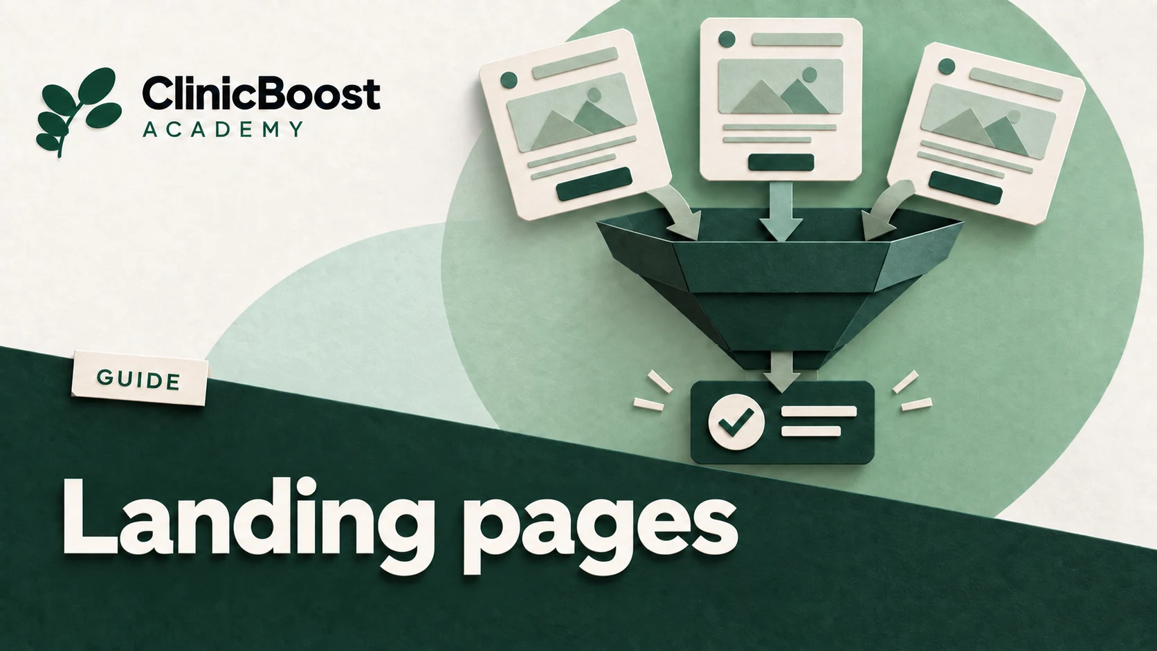
A landing page exists to convert one specific kind of visitor, arriving from one specific ad, into one specific action. Every element that does not serve that is subtracting from it, including your navigation menu.
One page, one message
Decide the single action before you write anything
Write the action at the top of a blank document. Book a first consultation. Request a callback. Join the waitlist. One of them. Then build the page toward that and nothing else.
If you cannot pick one, you are trying to build a service page. Build that instead and do not call it a landing page.
Remove the navigation
This is the change clinic owners resist most and it is the one with the clearest effect. A landing page with a full site menu gives a visitor nine ways to leave and one way to convert.
Keep the logo, unlinked or linked to the same page. Keep the phone number. Remove everything else.
No menu, no footer sitemap, no links to other services.The only outbound links are the legal ones you are required to have.Everything a visitor needs to decide is on this page, or they do not need it.Match the page to the ad, word for word
Whatever the ad promised must be the headline of the page, in close to the same words. A mismatch between the ad and the page is the largest single cause of a good campaign producing nothing.
The visitor spends a second confirming they are in the right place. Make that second easy.
Ad says evening appointments for adults. Page headline says evening appointments for adults.Ad shows a price. Page shows the same price in the first screen.Ad names a neighborhood. Page names the same neighborhood.Build the page in six blocks, in this order
This order is not arbitrary. It follows the sequence of questions a person actually asks, and answering them out of order loses people.
The promise, in a headline, plus the form or the button. Both visible without scrolling on a phone.What it is, in three or four lines. Plain language.What happens after you submit, step by step, including how fast someone calls.Proof: two or three reviews, real names, specific to this service.The practical answers: price or range, coverage, how long, where, parking.The form again, or the button again.In practice
The third block, what happens next, is the one almost every clinic omits and the one that moves completion most. People hesitate because they do not know what they are agreeing to.
The form
Break it into steps, even when it is short
A form of six fields on one screen completes worse than the same six fields across three screens of two. This looks wrong and it is consistently true. Each small screen feels finishable, and each completed step makes people more likely to finish the next one.
It also gives you something a single screen never can: the ability to see where people stop.
Step one is the easiest and least personal. What service, or what is bringing you in.Step two narrows it. Preferred time of day, or new patient versus returning.Step three is the contact details, and only then.A progress indicator on every step.Ask nothing you do not need before the call
The same rule as everywhere else in the clinic, and it matters most here because this is the page you are paying to send people to.
Name, phone, service. Email if you will actually use it.No health information. No symptoms. No insurance numbers. No date of birth.No optional fields. If it is optional, delete it.Fire an event at every step
This is what turns a form into something you can improve. Each step start and each step completion sends one event to your analytics. Then the drop-off is not a mystery, it is a number.
form_start when the first field is touched.step_complete with the step number, for each step.form_submit on the final submission.Name them consistently and write the names down. Renaming an event later loses the history.In practice
Send no personal information in these events. The event says a step was completed, nothing about who completed it. In a health context this is not a preference, it is the line.
Reading the drop-off
Build the step table and look at the biggest fall
Once a month, lay the steps out in a row with the count at each one. One step will always have a bigger fall than the others. That step is your entire optimization list.
A large fall between arriving and starting the form means the page is not matching the ad, or the form is too far down.A large fall at the contact details step is normal, and it is smaller when the step before it explained what happens next.A large fall at a middle step means that step is asking something people do not want to answer. Read the field again.A fall at the final submit means a technical problem. Test on three devices before assuming anything about psychology.
| Step | Typical pattern | What a bad number means |
|---|---|---|
| Arrived on page | 100 | - |
| Started the form | 20 to 40 | Below 15: the page does not match the ad, or the form is below the fold |
| Completed step 1 | 80 of those who started | Below 60: the first question is too personal or too vague |
| Completed step 2 | 85 of step 1 | Below 65: this step is asking something people resist |
| Submitted | 70 of step 2 | Below 50: usually a technical failure, test on real devices |
After the submit button
Route the enquiry to a person, not to a dashboard
The enquiry is warm for minutes. Build the notification before you launch, and make it reach a named human rather than a shared inbox that gets checked at four.
An email or text to a named person, within one minute.A copy into one list that anyone can see, so nothing depends on one inbox.A confirmation to the person who submitted, saying exactly when they will hear back.A monitored fallback: if the notification fails, somebody finds out the same day.Write the thank you page as if it matters
The thank you page is where people decide whether they will pick up when you call. It is also, technically, where your conversion fires, so it has to exist as its own page.
State the callback window in plain terms. We will call you before five today.Give the phone number in case they would rather call you.Say who will be calling and from what number, which meaningfully raises pickup rates.Nothing else. No upsell, no newsletter, no links back into the site.
When it goes sideways
| Symptom | Probable cause | Fix |
|---|---|---|
| Plenty of traffic, almost nobody starts the form | Page does not match the ad, or the form is below the fold on a phone | Put the ad headline at the top of the page word for word, and move the first step above the fold. |
| People start and stop at the contact step | They still do not know what happens after they submit | Add the what happens next block before the form, and say who will call and when. |
| Submissions arrive but nobody follows up | Notifications go to a shared inbox | Notify a named person, and add a second list as a fallback nobody has to remember. |
| Analytics shows no form events at all | The form is in an iframe, or the events were never installed | Check whether the form is embedded from another tool. If it is, the events have to be fired from inside that tool or on the thank you page. |
| Conversions counted twice | The thank you page fires the event and the form fires it again | Pick one place. The thank you page is the more reliable of the two. |
| Good completion rate, terrible enquiry quality | The form is too frictionless, or the ad promised something the page does not deliver | Add one qualifying question at step one and check the ad promise against the page. |
| Mobile completion is far below desktop | A field pushing the submit button under the keyboard, or a consent banner in the way | Complete the form yourself on a small phone in portrait. The failure will be visible in ten seconds. |
Before you send paid traffic to it
Questions we get.
- Can we just send ads to our home page?
- You can, and it will cost you. The home page has to serve everyone, so it serves the person who clicked your specific ad worse than a page built for them.
- How many landing pages do we need?
- One per campaign, which means one per service category you advertise. Not one per ad.
- Should we offer something in exchange for the contact details?
- For a service people are still researching, yes. For a service people need now, no. Adding a download step between a ready patient and a booking loses more than it captures.
- Our booking tool has its own form. Should we use that instead?
- If it can be instrumented and it passes the click identifier through, yes. If it is an iframe you cannot measure, build your own short form and have a human book them.
- How long before we can judge the page?
- A few hundred visits. Below that, the differences you see are noise, and clinics regularly rebuild pages on the strength of forty visits.
This guide is general information for clinic owners. It is not clinical advice, and it does not replace the guidance of your professional body or your own advisers.